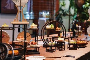
Color psychology influences how we design our homes
When it comes to designing our homes, the choices we make are often a reflection of our personal style and preferences. However, have you ever stopped to think about how color influences our design choices? It’s no coincidence that certain colors are used more prominently than others in interior design. In fact, color psychology plays a significant role in how we choose to decorate our living spaces. In this article, we will explore the fascinating relationship between color psychology and home design, and how understanding it can help you create a more harmonious and visually pleasing living space.
The Basics of Color Psychology
Before we dive into how color psychology affects our home design decisions, let’s first understand what it is. Color psychology is the study of how different colors can affect our emotions, behavior, and even physiological reactions. This concept is based on the idea that colors have the power to elicit certain feelings and create specific moods.
It’s important to note that color psychology is not an exact science, as different individuals may have different reactions to the same color. However, there are some general associations that have been observed and widely accepted by designers and psychologists alike.
Red: The Bold and Energetic Choice
Red is a very powerful color, often associated with strong emotions such as passion, energy, and excitement. When used in home design, it can create a bold and stimulating atmosphere. It is often used in spaces where people gather and socialize, such as a living room or dining area.
However, too much red can be overwhelming and may even evoke feelings of anger or aggression. Therefore, it’s important to use this color sparingly and balance it out with other calming tones.
Blue: The Calming and Serene Option
Blue is often seen as a soothing and calming color, associated with tranquility, stability, and trust. This makes it a popular choice for bedrooms, bathrooms, and other areas where relaxation is desired.
On the other hand, too much blue can create a somber and melancholic atmosphere. To avoid this, try using different shades of blue or combining it with warm tones to add some balance to the space.
Yellow: The Energetic and Cheerful Color
In home design, yellow is often used to add a sense of positivity and warmth. It is associated with happiness, creativity, and optimism. Therefore, it is a popular choice for areas where people gather and socialize, such as the kitchen or living room.
However, too much yellow can be overwhelming and may even cause feelings of anxiety or restlessness. To avoid this, it’s best to use yellow as an accent color and pair it with more neutral tones.
Green: The Natural and Soothing Hue
Green is often associated with nature, growth, and freshness. As a result, it is a popular color choice for rooms that are meant to promote relaxation and well-being, such as bedrooms and home offices.
Nevertheless, too much green can have a dulling effect on our emotions. It is best to pair it with pops of brighter colors to create a more dynamic and balanced space.
Black and White: The Classic and Timeless Combination
While technically not colors, black and white play a crucial role in home design and can greatly influence our emotions. Black is often associated with elegance, sophistication, and authority, while white represents purity, cleanliness, and simplicity.
The classic combination of black and white can add a sleek and modern touch to any room. However, it’s essential to balance these colors with different shades and textures to avoid creating a stark and cold atmosphere.
Incorporating Color Psychology into Home Design
Now that we have a better understanding of how colors can impact our emotions, how can we incorporate this knowledge into our home design choices?
First, consider the function of the room you are designing. Is it a room where you want to promote energy and socialization, or one where relaxation and tranquility are desired? Use this as a guide when selecting the color palette for the space.
Additionally, don’t be afraid to experiment with different shades and combinations. For example, pairing blue with yellow can create a balance of calmness and cheerfulness, while using various shades of green can add depth and interest to a room.
Lastly, don’t forget to consider your personal preferences and how certain colors make you feel. Ultimately, your home should be a reflection of your unique style and personality.
Final Thoughts
Color psychology is a fascinating concept that can greatly impact how we design and experience our living spaces. While there are no hard and fast rules, understanding the general associations of colors can help us create a more harmonious and visually appealing home. So the next time you are redecorating or designing a new space, don’t forget to consider the power of color.